A shocking discovery
We have done it. 🎊 After six long months (more or less) of talking to customers and stakeholders, we shipped Paikari to the public.
After a while on our analytics platform, we found that users were not using Stock Khata — the stock management feature. To be more precise, users were stocking in, but not stocking out.
Key actions on Stock In outnumbered key actions on Stock Out. It was supposed to be the other way around.
The core value proposition for Paikari was to make sense of a messy business operation and its calculations, and give owners peace of mind that they haven’t misplaced or miscalculated any products or pennies. With razor-thin profit margins, each penny counts.
We had failed to deliver on that promise. Customers weren’t using the core feature, and it was time to return to the drawing board.
Stock out was at the core of the experience
Stock management is at the core of the app. Mismatched stock-out reports meant a miscalculated current stock, which led to inaccurate profit and loss. It all trickled down into a subpar experience and a frustrated user.
Due management, the stock report and business reports all depended on accurate tracking of stocking out.
Problem space
Stock Khata was complex, and there was a dissonance between the actual operations of a wholesale business and our app.
How can we make the experience simpler, unified yet contextual, so people can easily manage their stock?
Research and discovery
Understanding how, what and when people stock in and stock out. We spoke to 12 wholesalers across Dhaka, on site.
- A research plan for 2 weeks
- A mix of long-time app users and new users
Speaking to Paikari users about their business habits was super insightful, and it drove the key decisions for the experience.

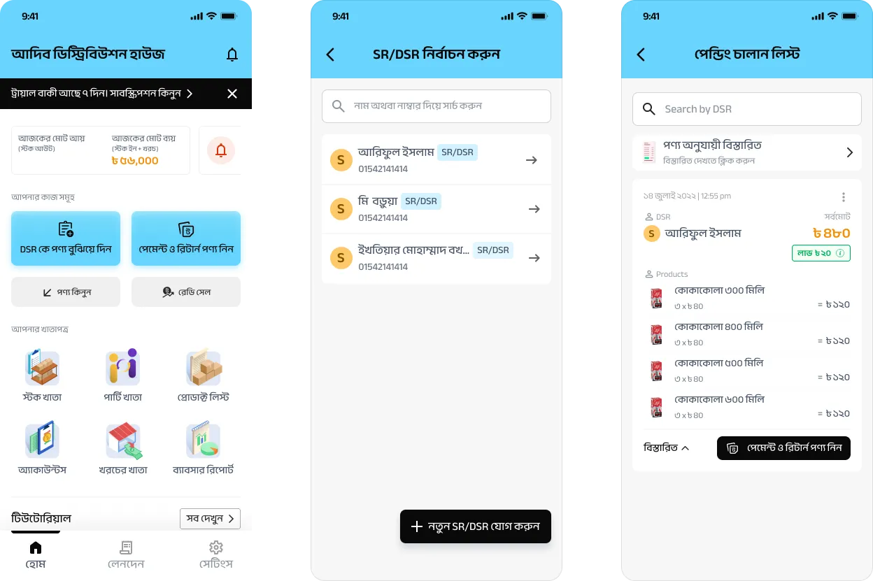
😵 Where to go from the home screen?
This is what our home screen looked like. One user said during an unmoderated interview:
“Where do I go from here?”
A simple question that made us rethink the whole home page, and later take steps towards user activation (not covered in this case study).
🧾 Stock in and stock out don’t happen linearly
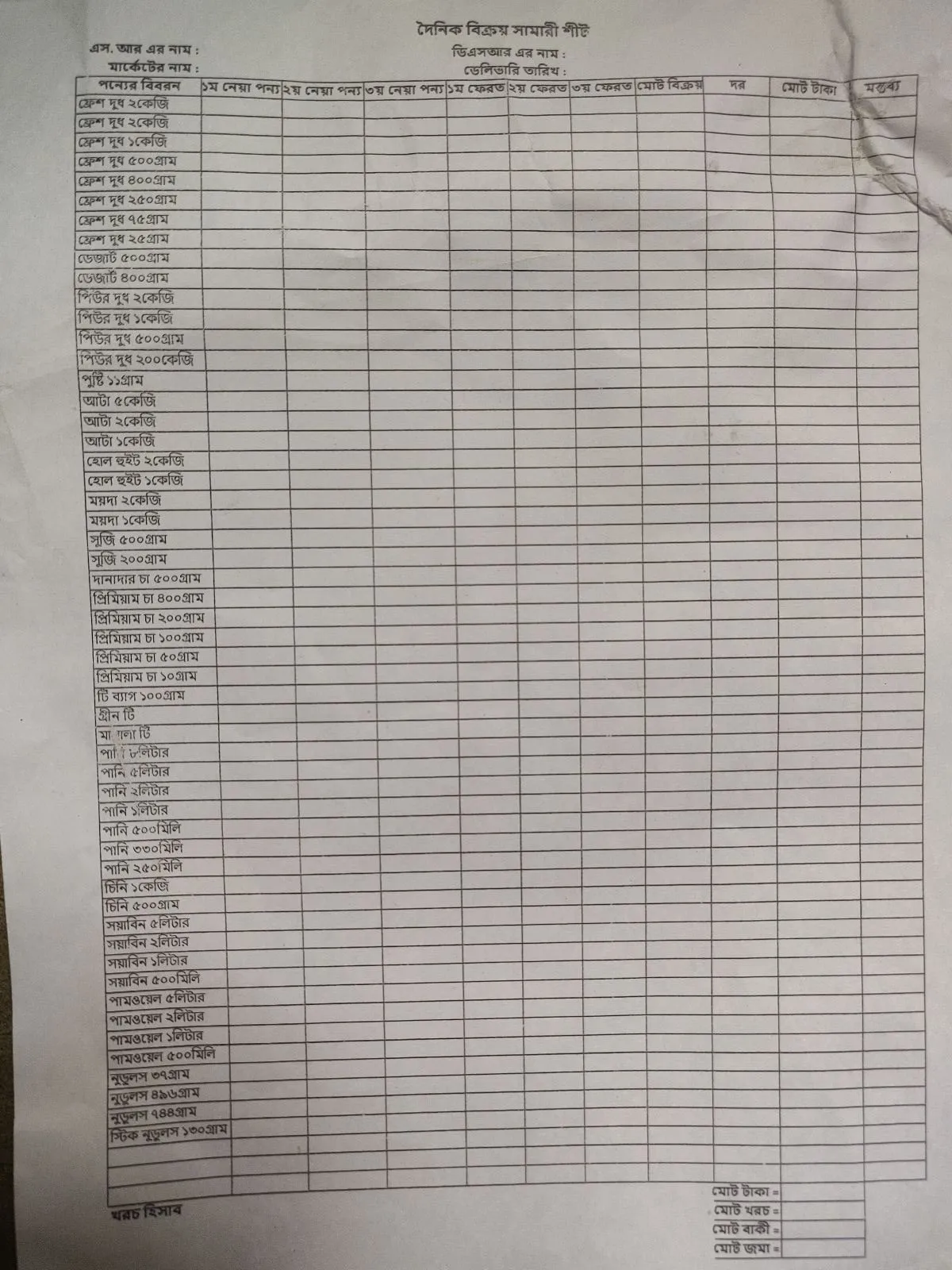
We had planned for a basic stock-in and stock-out flow. When businesses received products from manufacturers, they would enter them. As they sold, they would track the sales. At the end of the day, unsold and returned products — common in wholesale — would go into a separate return flow.
Some wholesalers used their own custom-made forms to track daily sales and stock.
🤝 Stocked out isn’t really stocked out
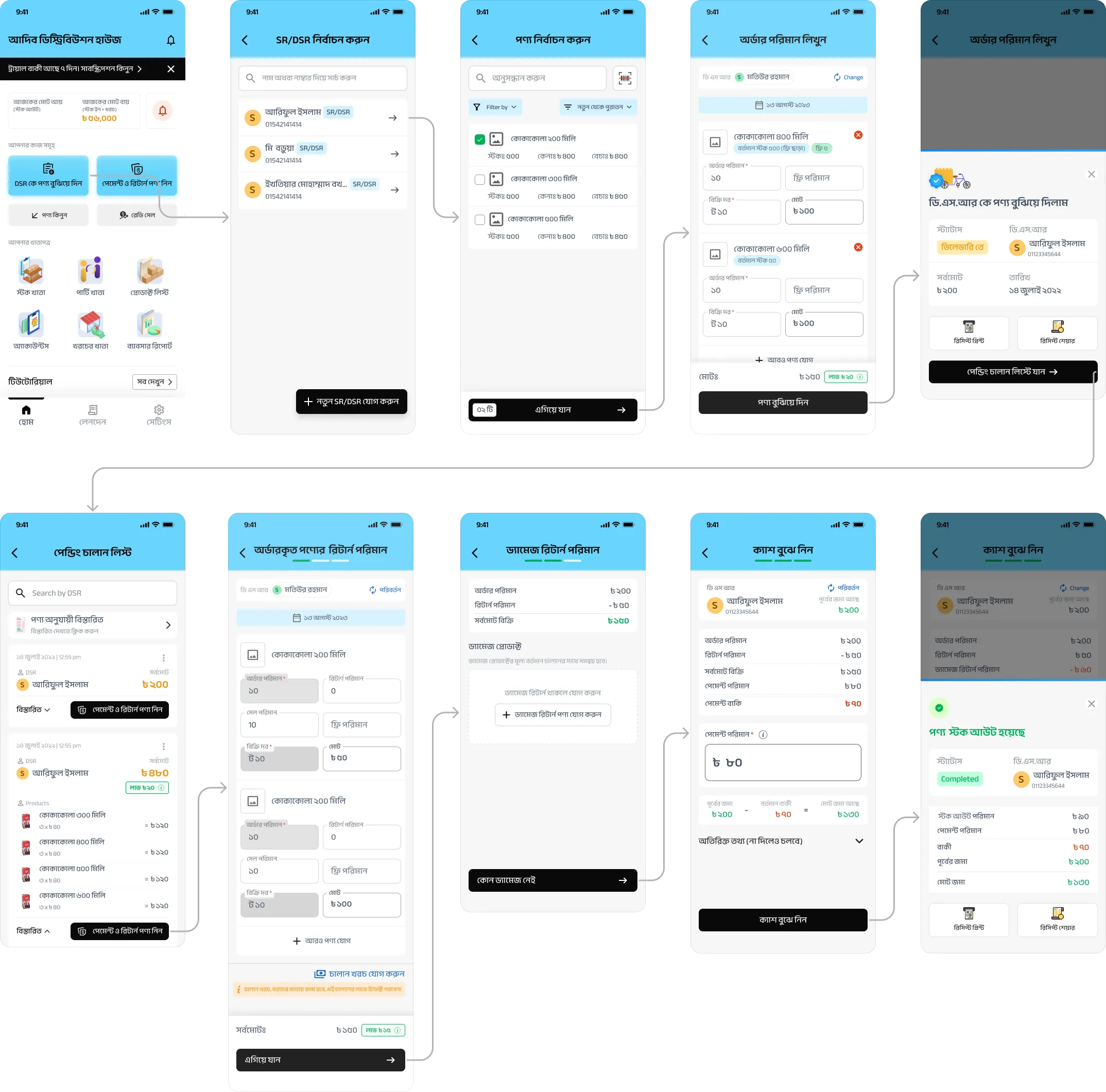
The day before, sales representatives (SRs) — employed either by the wholesaler or by manufacturers like Pepsi, Pran or Unilever — go shop to shop collecting orders. Those sale receipts, called challans locally, are handed to our customers. Their delivery agents (DSRs) check the challans, load the vans and go out to deliver.
Products out for delivery are like Schrödinger’s cat: they could be sold, or rejected by the shop and returned to the wholesaler.
Shop owners might also return products from a previous delivery, intact or damaged (labelled damage returns).
Recurring themes and goals
- Trust — carry the trust they have in their tried and tested pen and paper over to our app.
- Empowerment — help them run day-to-day operations confidently.
- Simplification — get the job done simply and get out of the way. Not extra cognitive load, but a copilot for their hectic calculations.
Going back to the drawing board
Once we understood their business and needs in depth, we iterated countless times and brainstormed as a team. Whenever we caught ourselves making assumptions, we went back to users on a quick phone or Zoom call to stay grounded. Our motto:
Test fast, fail fast, iterate fast.
Stock out: a pending state
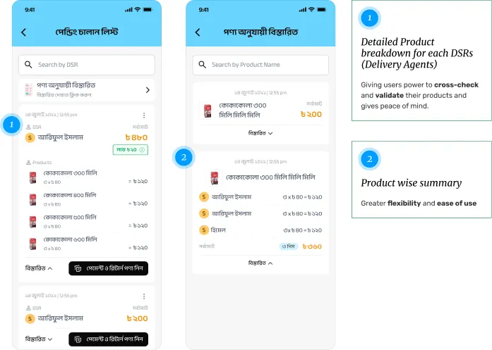
Products aren’t entirely stocked out when they leave. We observed and heard that wholesalers keep a copy of the receipt as a pending state, so they can track products out for delivery that day.
- Detailed product breakdown per DSR — lets users cross-check and validate their products, for peace of mind.
- Product-wise summary — greater flexibility and ease of use.
Product returns and additional costs
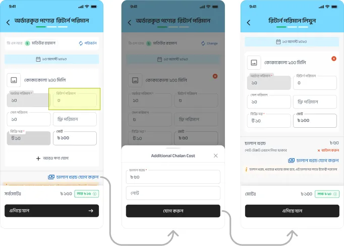
Enter the amount of products that were unsold or returned; the rest is calculated automatically.
An additional cost input tracks unexpected costs that come up during delivery — costs that hit the bottom line.
A breakdown of the calculation
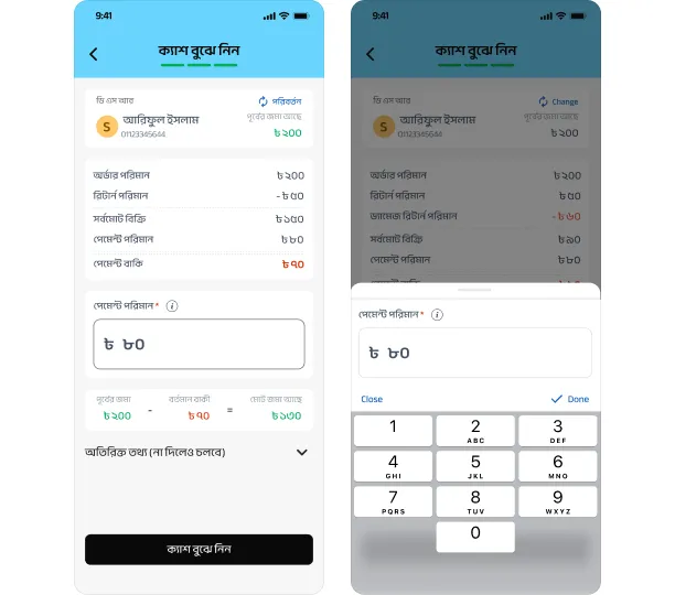
Whether the shop paid in advance or is taking products to repay later (due), a detailed breakdown of every calculation lets users make their transactions confidently.
Lessons learned
1. Keep one eye on data and both ears on customers.
Data will only tell you what. Customers will tell you why.
The initial question was simple: a data point wasn’t behaving the way it was supposed to. It evolved into a major experience improvement for the product as a whole.
2. Users are your co-creators.
We adopted a co-creation approach for the whole project. Customers were designers too, informing us every step of the way, and we listened. Whatever UX method you use, listening to customers pays off tenfold.
3. Iteration is the key.
Rome wasn’t built in a day, and it’s very, very unlikely our products will be either.