What does Housecall do?
Housecall is a healthcare service in the UAE — Abu Dhabi, Dubai and Al Ain. Through one app, people book in-person and virtual consultations with licensed doctors, get lab tests at home, and have prescriptions delivered.
The patient registration flow
When a new appointment is made, it appears in the registration dashboard with its booking details. To prepare the patient for the visit, they must be registered in the Cortex EMR.
An admin compares the new patient against existing Cortex records, then verifies their insurance eligibility. Insurance details, including a confirmation screenshot, are uploaded to the EHR.
Problem space
The admin team wants to register patients quickly and without human error. But the platform was missing necessary functionality, and had redundant steps — a real problem when each admin registers upwards of 100 patients a day.
On top of that, an upcoming digital health feature required patients to be registered in 30 seconds.
After digging into the platform and talking to the admin and engineering teams, I found constraints the design had to work around:
- ⚙️ Cortex EMR is integrated with the Housecall EHR through an API. The admin clicks Register in Cortex to prepare the data sent to Cortex.
- 🗻 The admin pastes the patient’s Emirates ID into a separate portal provided by the insurance company.
In an ideal world these would be automated. In the real world, regulatory and compliance rules meant the design had to accommodate them.
Matching the patient in Cortex
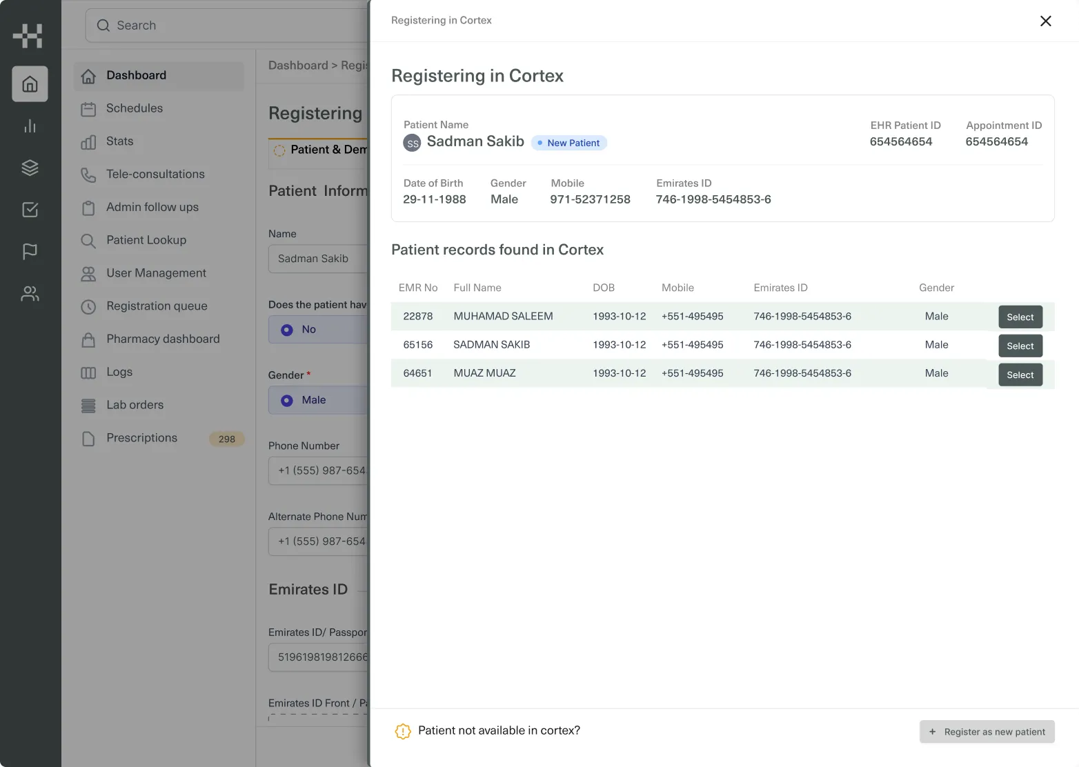
Registration starts in a side panel. The new patient’s details — name, IDs, date of birth, mobile and Emirates ID — sit at the top, directly above the matching records found in Cortex, so the admin compares them in one view and selects the right record, or registers the patient as new.
Leaning on short-term memory
The common problem throughout registration was a heavy reliance on short-term memory. I watched admins memorise the last digits of an Emirates ID to cross-match it against an existing Cortex profile.
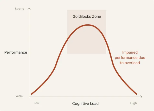
When you register patient after patient, even that small cognitive load adds up and limits how well you work.
Oh, the long and messy form
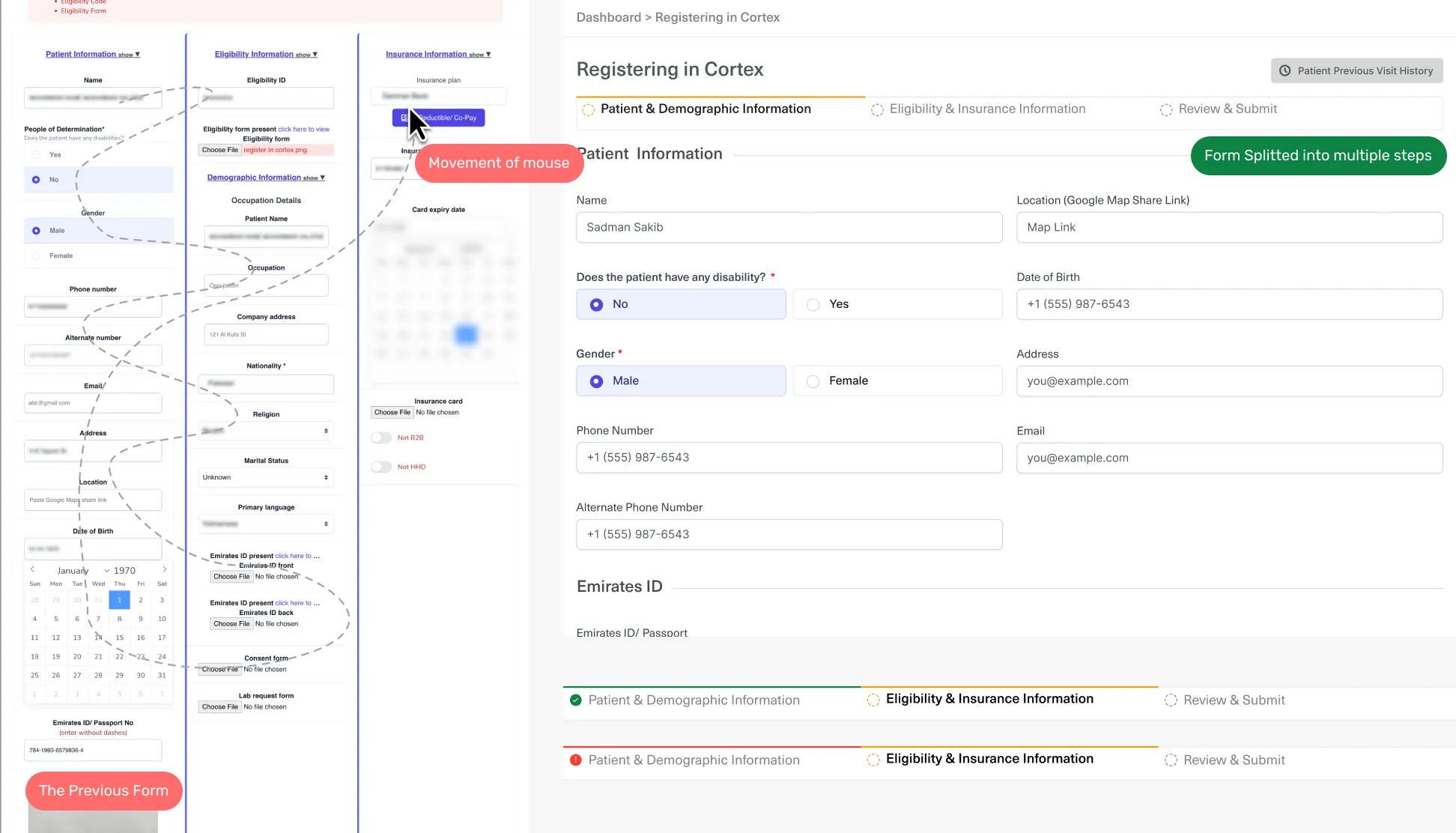
When I first saw the form that had to be filled in, I was visibly shocked. Beyond the sheer number of fields, the experience itself was questionable — you can see it in how the mouse moved while completing the task.
The new form is split into three steps: patient and demographic information, eligibility and insurance, then review and submit.
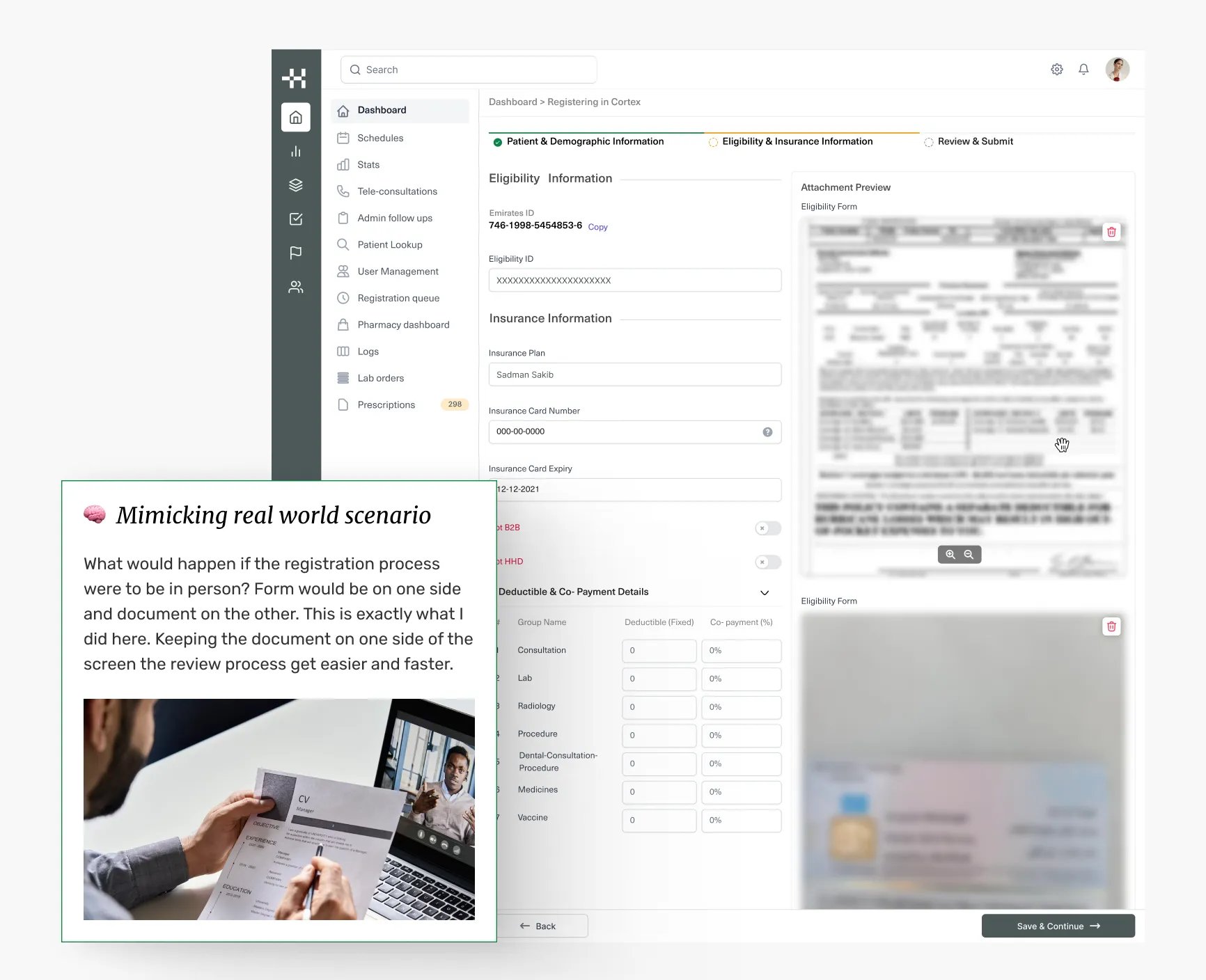
🧠 Mimicking the real world
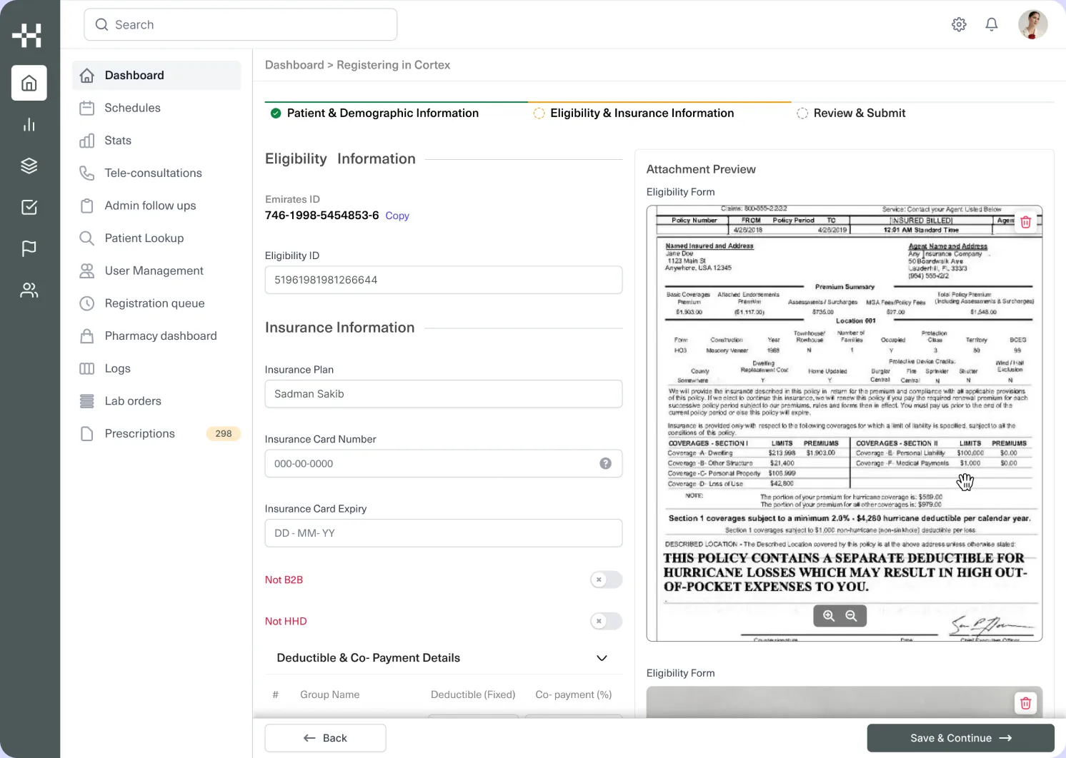
What would registration look like in person? The form on one side, the document on the other. That’s exactly what I did here: with the document kept on one side of the screen, review gets easier and faster.
I added image preview and zoom. Being able to cross-check information without leaving the tab or window made the task significantly faster to complete.
My impact
- I was able to empower users and the business.
- I played a pivotal role in the revamp of Housecall’s EHR, breaking a complex UI and flow down into a registration system that is less prone to human error, and implementable.
- Foundation of a new design system — Care. This was my first project at Housecall, and it laid the foundation for the EHR’s new design system. EHRs are historically complex, with a lot of moving parts; I experimented heavily in my mockups to strike a balance between form and function.